HNCB’s Design System

2021  • IBM  • Product Designer
Establishing a design system for creating a consistent banking experience
Background
When I was working at IBM, our team built a new app for HUA NAN Bank. We needed to establish standardized components, a design guideline, and a design system for the bank. We also needed to create a consistent visual experience and enable the bank to maintain it in the future.
Objective
For this project, I was in charge of defining the visual of the product and organizing the components into a design system for designers and engineers to use. At the same time, we also need to make sure the bank is capable of maintaining its app through our document in the future.
My roles and responsibilities
1.
Define design system and design guideline.
2.
Help designers check the components of the design.
3.
Document the design system.
My Team
Work with 1 UI designer, 4 UX designers, and a development team.
Design system
Design guideline
What is the difference between a design guideline and a design system?
Design system:
Let the design team create a consistent interface.
Design guideline:
When IBM deliver the app design to the bank, the guideline helps their employees to understand each component and be able to maintain it on their own.
Challenge
1.
How do I build a design system for designers to use in a short time? 
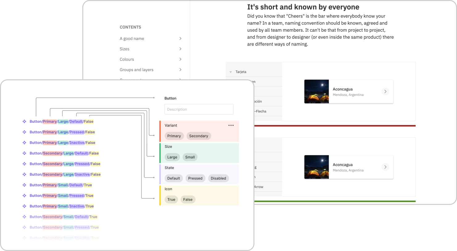
Since the UX designers of my team need to use components to develop other functions, I need to put basic components as my priority, for example Buttons, Text fields, etc.
2.
How do I get other designers (4 designers) to build components into the system? How do I define the rules?
When other designers plan new features and need to create new components, they can find the rules themselves. 
3.
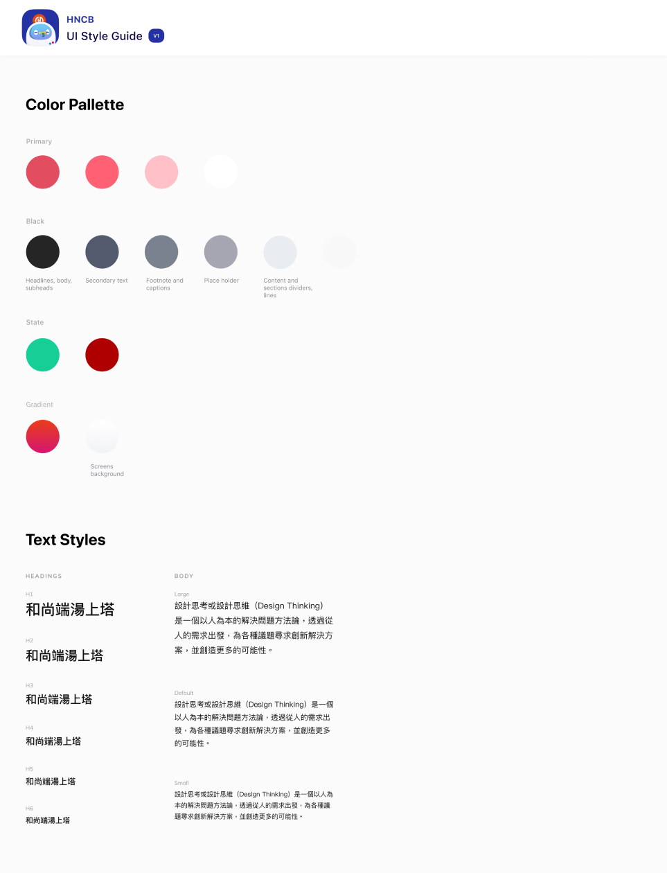
How do I create a document to let bank employees know how to use each component in the future?
I need to define which components and information should be included in the design guideline, such as component status, usage, etc.
Goal
The design system should save designers’ time and works so that the team can consider more about the new concept which focuses more on delivering a better user journey. Just like by using Lego bricks, it’s fast to sculpt and visualize the fantasy in your head.

The purpose of the design guideline is to be accessible for the bank employees to use. It contains the usage of each component in detail so that the bank employees could maintain it. Therefore, the three goals are summarized.
Agreement on the best practice & guideline
Apply the practices across the team
Easy-to-use design guideline
Design Process
This is a project to build a design system and a design guideline from scratch. The following is my design process for this project:
How do I get started
Define the visual of key pages
Since we need to help the client to create a new App, our job is to define the design system and design guideline from scratch. First of all, our design lead defines which are the key pages in the app. Then the UI designer and I experimented with different visuals. After discussing with the client and our design team to determine the visual of the key pages, we started to build some of the basic components.
What are the key pages?
Key pages are the pages that are important or frequently displayed. For example, in a bank app, users often have money transactions, so to ensure user safety, every feature will have form pages, a confirmation page, and a result page which are frequently displayed pages. And the important page is the home page of the app.
Home page
Form page
Confirmation page
Result page
Delivery schedule for each page and function
I show the design of the key pages and discuss the design direction with the clients
Define icons and illustrations
I define the visual style of icons and illustrations to make the visual style of the app clearer.
Icon
illustrations
Establish basic design systems
After defining the visual of the key pages, we start to establish basic components through key pages, and icons and organize these components into a basic design system.
Basic Design System
Check components and pages
I need to review UX designers’ components and pages when they start coming into projects. Because when they start designing new features, they usually create new components. In each creation, I will help them check whether the components and pages conform to the overall style and whether it is necessary to add components. When I see some of the components are having problems or are adjustable, I will also help them to modify them.
We discuss and review the use cases of specific components together, and clarify and define the principles. I will check the newly created components by UX designers. When there is a problem with the components, I will adjust them, and the UX designer will review them again.
My work with engineers
When the review of the components is completed, the new components will be put into the design system.  I will add comments on Figma to remind the engineers about new components. Engineers will consult designers when they have problems such as components being broken when supporting multiple languages, etc.
Designer and Engineer Collaborate
Divide components into three states:  developable, adjustable, reserved for potential use
Define component naming
As we create more and more components, component names got longer, and we realize that components are getting harder to find. It slowed down the productivity of UX designers, so I redefined the component naming.
Find information about component naming
Confirm component naming with engineers
Gradually build a more complete design system
When there are more features, more components are created, and the design system becomes more complete.
Complete design system
Design guideline defines how each component is used
With a more complete design system in place, organize each component into a design guideline that includes the composition, usage, and application examples of each element, enabling the bank to maintain it on its own in the future.
Design guideline
The design system and design guideline enable the design team and developers to have a consistent product design and facilitate future maintenance by the bank.
Impact
1.
Design consistency
Our product has complete visual and interaction consistency.
2.
Accelerate the work pace of UX designers
Designers can use the existing components to compose screens and speed up their work efficiency.
3.
Define the overall app visual
We help banks define the foundation and structure of app visuals.
4.
The bank employees can maintain the App by themselves in the future
Bank employees can easily find and use components with the help of the comprehensive design guideline. 
Hun Nan Commercial Bank+ was designed/implemented during the process and successfully launched in 2022.

Hun Nan Commercial Bank+
2022
Learning Outcomes
In this project, I collaborated with many people from different professions, such as engineers and UX designers. Here are the things I’ve learned : 
1.
The naming logic for components should be defined at the early stage of component creation and discussed with partners, such as UX designers and engineers, otherwise a significant amount of time and effort will be required for adjustments later on.  
2.
When designing a large number of pages, it may be necessary to go back and modify the originally defined components.
3.
Clear specification labeling of components can save a significant amount of communication costs with engineers.