Assist users in understanding the status of their various financial goals in their lives, and achieving them through funds
Background
This was a project I worked on at IBM in 2021, where our client was Hua Nan Bank, which is a large bank in Taiwan. We were responsible for planning, designing, communicating, and coordinating the entire new app. Among them, I was solely responsible for the Target Wealth Management Account feature.
What is a Target Wealth Management Account?
The Target Wealth Management Account automatically predicts whether the target can be achieved after the funds are deposited. When the target is not met, this feature provides recommendations for purchasing funds.
Objective
The focus of this project was to create a new UX, visual, and information structure to make this feature a better and more familiar experience, as well as to understand what this feature is, and to attract users to use it.
My roles and responsibilities
1.
I was responsible for the overall UX and UI design, from defining the problem to delivering the final visual artifact and making prototypes.
2.
I listened to clients’ needs and resolved the goal conflict between business metrics and customer experience.
Team
Worked with system analysts, development team, and a researcher.
User Study
I worked with a researcher to figure out the types of users we wanted to find and what we hoped to observe during the interviews.
In the beginning, I worked with a researcher and interviewed eight users. We clarified the potential problems users may have and gained insights into their daily life behavior. This helped me better understand the user’s pain points in the past.
The researcher interviewed users
Based on user interviews, three different user personas can be identified:
Josh
I am going to retire soon, I want to start planning my retirement life. I'm not sure what the target amount I might need in the future.
# Doesn't know the total target amount
Amy
I have been working for a while and accumulated some money. I hope to buy a house and a car with my fiancé after getting married, and I have a rough idea of the cost of buying a car and a house.
# Know the target amount
Angle
I just learned how to invest, I don't know much about investing.
# Investment newbie
Brainstorm and generate user journeys
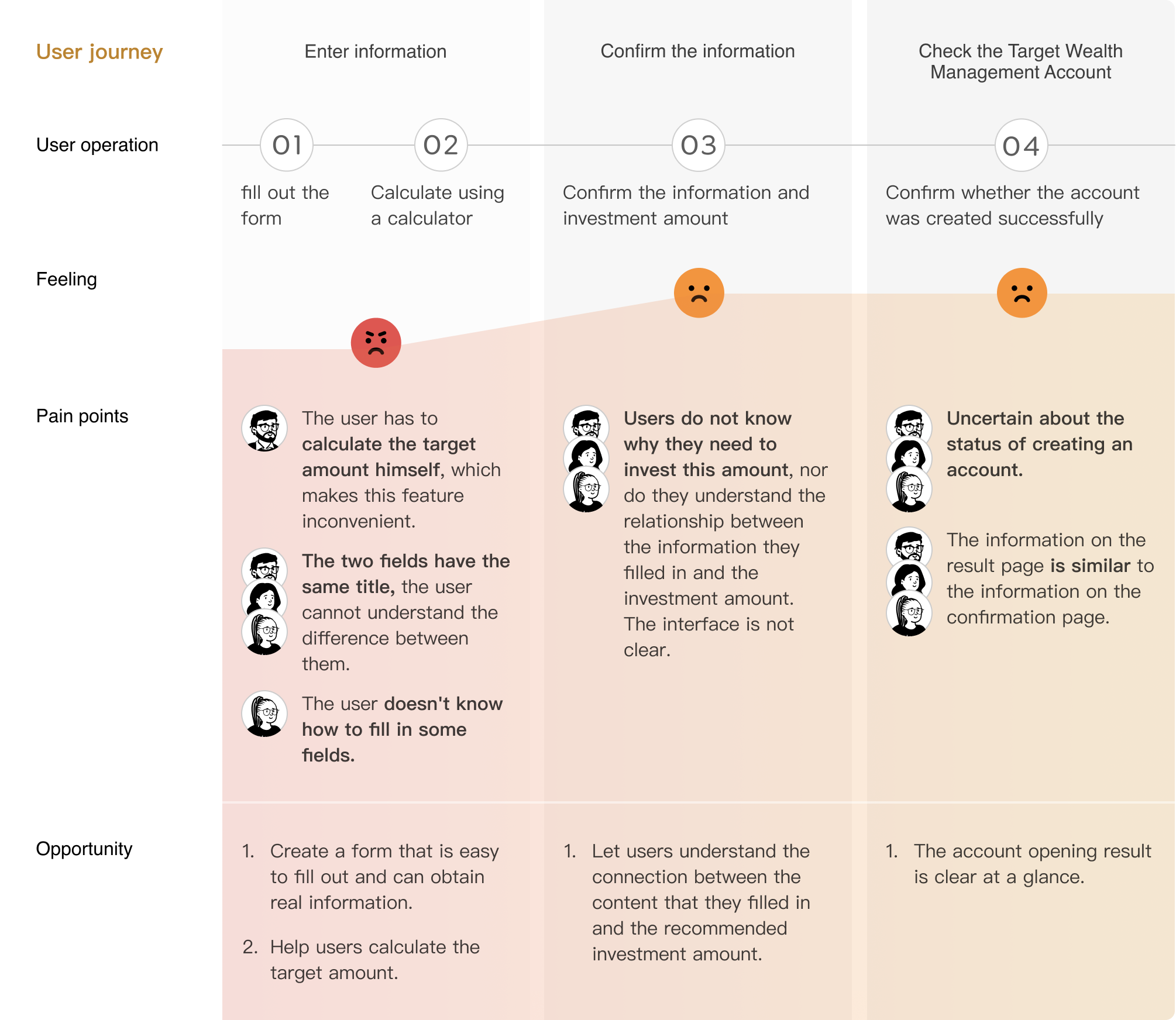
Before I jumped into solutions, I spent several hours with a researcher to generate as many ideas as possible based on the user’s pain points, opportunity points, and backgrounds. In addition, we also drew the entire user journey for users to make sure the experience of different users were logical. Pain points and opportunity points encountered by the three different user personas in the user journey:
Problems
These user problems can be summarized based on user journeys and user interviews:
Overall, many problems occurred in the operation of the user, resulting in not wanting to use it.
Principles & HMWs
Brainstorm possible solutions through the pain points of users, and define the design principles for this time.
Now, we’ve identified problems that pose challenges to the users' design. We tried to use brainstorming to categorize problems and reframe them as How Might We questions to turn those challenges into opportunities for design. We made sure that our How Might We weren't too broad. It gave us a narrow enough frame to let us know where to start our design.
Easy to understand
How might we enable users to understand what the Target Wealth Management Account is, understand the meaning of each field, and complete all the information to be filled in?
Simple and accessible
How might we enable users to easily and quickly complete the operation of the Target Wealth Management Account?
Process
Analysis of competitive banking products in Taiwan
Competitive analysis
In addition to the ideas captured in the design office, I also wanted to grab inspiration from well-designed existing applications that tackled the same problems. I studied the bank's information hierarchy, organizational layout and to help users understand complex investment information.
Search some financial information
Information collection
This project is related to the bank, so I searched a lot of financial knowledge on the Internet to help myself think about the design better, and hope to bring users a more concise operating experience.
Sketches
Wireframes
Sketches and wireframes
I sketched multiple user flows and screens to visualize ideas quickly. My focus at this stage is to diverge first, and converge later. Here are some early sketches and wireframes of the onboarding page.
Mockup
I went through 20+ iterations
The initial designs went through discussions with system analysts, the development team, and the design teams to ensure we have a friendly and scalable user experience.
Final Design
Onboarding page
Let the users know what the Target Wealth Management Account is
According to the user interviews, it is found that more than 50% of users do not know what the Target Wealth Management Account is, and do not want to use it because of that. I added a Target Wealth Management Account login page to help them better understand what a Target Wealth Management Account is and the benefits it can bring to the users.
Page content:
1.
Set a target
2.
Deposit funds
3.
Easily track funds accumulation progress
Users can understand the fields and easily complete the form page
Help users calculate the target amount field
Some users are not very clear about their target amount in the future, such as people who are planning for retirement. Therefore, I discussed with the client and the system analysts to develop a formula that allows users to automatically calculate the target amount when filling in certain fields.
Help users differentiate between different fields
In the old interface, there are two identical titles for "Expected Rate of Return". In the new interface, it is differentiated by field titles, which are "the rate of return during the withdrawal period" and "the rate of return during the investment period".
I also added an info icon to let users understand the difference between these two fields.
Make the form page user-friendly
Some fields are too professional, such as rate of return and inflation rate. Invest newbies may not know how to fill it out.
Therefore, I checked Taiwan's return rate and inflation rate in the past six months and set them as default parameters.
I also allowed users to select the investment type, which automatically populates the return rate for their investment period.
Make it clear to users why they should invest this amount
Add a chart to help users understand the relationship between the information they entered and the system’s recommended investment amount. This chart is generated based on the information the user entered. The right side is the user's target amount, the investment period is on the bottom, and the rising curve is the return on investment.
After reorganizing the information hierarchy, key information is more obvious
On the confirmation page, the most important information is whether the account is set up successfully. I redesigned the information hierarchy to make the information clearer.
Easy to deposit into multiple funds
If users have multiple funds in the bank, they can directly deposit them into the Target Wealth Management Account.
Add funds to the account with one click
Final prototype
Usability Test
I discussed with researchers the type of users I wanted to find and the contents I wanted to observe
User interview
After the design is finished, I conducted user interviews with the researchers to verify whether the design process met user experience requirements.
When the user finished operating the prototype, we provided a product reaction card. We asked them to choose adjectives that match how they felt after using it. The four most popular adjectives:
1.
Practical
2.
Time-saving
3.
Easy-to-use
4.
Essential
In the user interview, the users said how they feel about the operation:
I can complete the operation very intuitively, and the process of using it will not be very circuitous
Usability Test Results
System Usability Scale Result
Target Wealth Management Account scored 82.5 Obtained a grade of “B”
In the usability test, users can complete the operation of the target account and understand that it involves investing in funds. Therefore, the development can proceed with this feature.
Impact
The new app has been launched in the middle of 2022. On Google Play, it has a rating of 3.8 with 81 reviews. Overall, users found it easy to understand and smooth to use.
As a consulting company, it is difficult for us to know the user usage data for the individual feature. If I have the opportunity to monitor the data, I would look at the user completion rate of user account registration, and see if there is a particularly high churn rate at any point. Then we can consider further optimization iteration.
Learning Outcomes
In this project, I learned how to think outside of the existing framework and come up with new ideas based on user experience. I tried multiple designs, discussed and iterated with the design lead. Finally, we use the usability test to verify the hypothesis and summarize some learnings:
1.
Most users don't like to read text, so illustrations are used on the Onboarding page to explain the functions of the Target Wealth Management Account.
2.
Users should be able to intuitively complete tasks and know that the information they fill in is crucial for completing the form. When users do not know how to fill in certain fields, they are likely to exit or stop the task.
3.
The relationship between the filled content and the estimated calculation results should be easy to understand, so that users can invest based on the result.